

Client: Mahina Hawley Photography
Project: Identity Branding
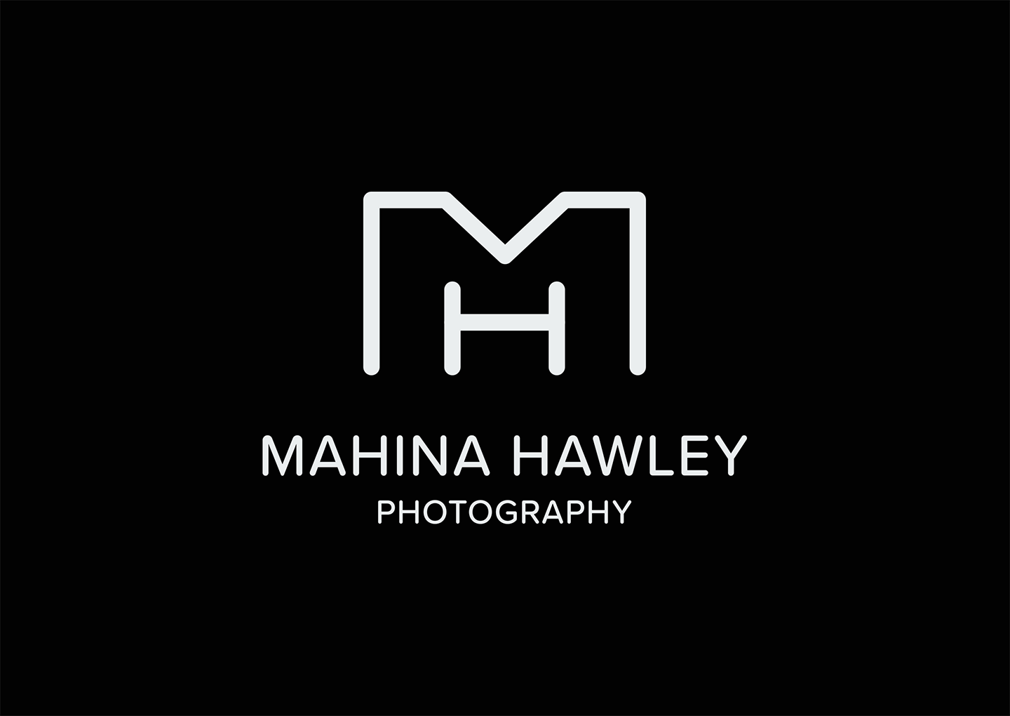
Project Overview: Mahina approached the project with a clear vision: she wished for her identity to reflect simplicity and sophistication without feeling too rigid. She also wanted to stand out from the other competitors.
Design Concept: The symbol featured clean lines, reflecting the simplicity she sought, while also softening the edges with rounded corners. This added a more approachable feeling to its overall appearance. A review of local competitor identities confirmed that her logo would be easily recognizable.
Execution: In the execution phase, we meticulously refined the symbol, ensuring that every curve and line contributed to the desired impression. The simple color palette of black and white not only complemented Mahina's beautiful photography but also ensure that her logo remains visible on digital and printed assets.
Role: Designer, Client Liaison
Photo of Pine by Annie Spratt
Photo of Child by Mahina Hawley