


Project: Brand Refresh
In-House: Geocaching HQ
Project Overview: Geocaching HQ's in-house creative team undertook updating Geocaching's brand. The creative brief: Develop a brand that would take the geocaching community beyond the everyday. The targeted audience is everyone.
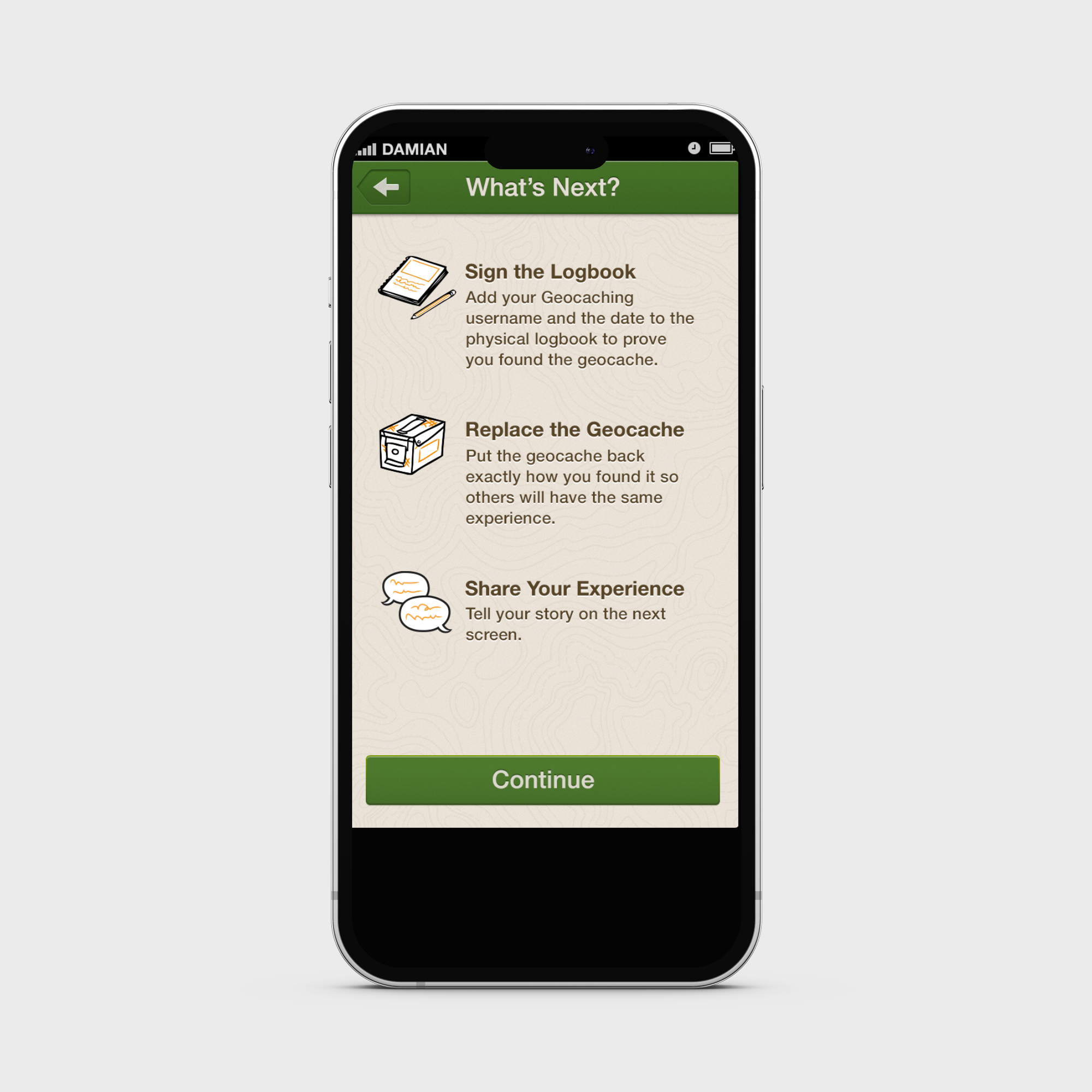
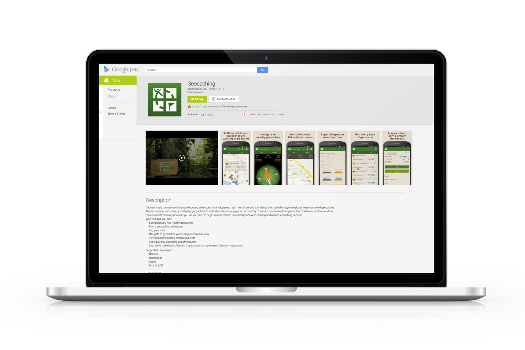
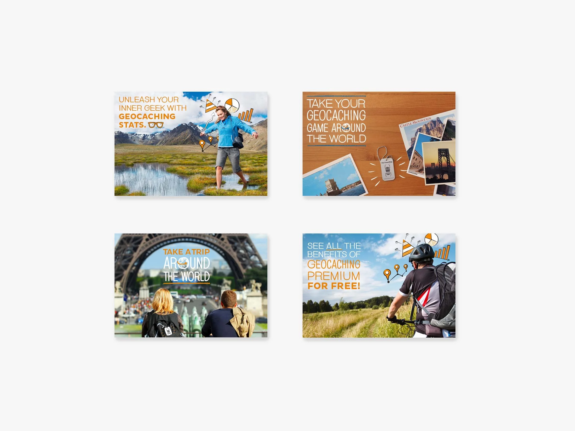
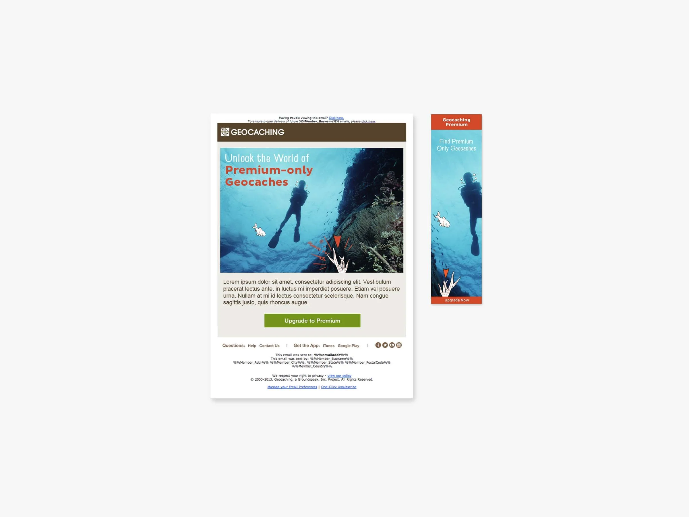
Design Concept: With 7 million global members and creators, the creative solutions needed to be flexible for a wide variety of assets and audience. Identity, icons, colors, typefaces, visuals and copy were all meticulously and strategically reviewed. This included updating the 4-color logo to a simplified one color palette, a more inclusive variety of photography and modern, relevant illustrations.
From ideation to planning, I led the creative team through the process while cross-collaborating with other departments. I worked closely with Marketing and PR to establish clear communication about the brand refresh to our audience.
Results: The new visuals, media and tone attracted a more diverse, international audience. Happily, I have observed that eight years later, the original concept of illustrations over photography is still being employed. This serves as proof that the strategic branding decisions made with geocaching were sound.
Role: Creative Direction, Art Direction, Co- Designer, Project Management, Stakeholder Management